
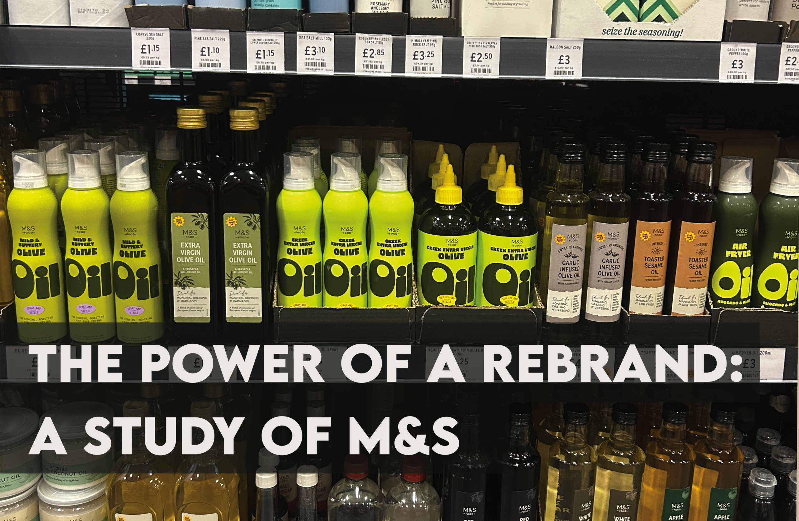
We all know Marks & Spencer: the stylish, premium retailer widely considered one of the “poshest” supermarkets on the high street. M&S has built its reputation around exceptional quality, British heritage and a polished shopping experience. However, successful branding is never just about having a recognisable logo or choosing an attractive font. It is about creating an experience that shapes how customers perceive a product, often influencing their decisions in ways they may not consciously notice.
Over the past year, M&S shelves have started to look noticeably different. Products that were once presented through refined, minimal packaging are now decorated with vibrant colours, expressive typography, bold graphics and illustrated mascots. Viewed side by side, the change is striking. It reflects not only a shift within M&S, but a wider change in what customers are beginning to value from brands.
Premium branding has traditionally relied on restraint. Muted colours, elegant serif fonts, generous white space and carefully structured layouts are commonly used to communicate sophistication and quality. M&S has not abandoned its premium identity, but it has started challenging the idea that premium design must always be minimal, serious and predictable. Across many of its newer products, the bespoke M&S London typeface has been replaced or complemented by larger, less uniform typography created specifically for each item. Some lettering feels hand-painted or loosely drawn rather than positioned within a rigid grid. Even where traditional serif fonts are used, individual letters may be stretched, skewed or manipulated to give the packaging more character.
These imperfections make the designs feel expressive, tactile and human.
This feels particularly relevant in an age dominated by artificial intelligence and endlessly polished digital content. When almost anything can be generated, adjusted or perfected within seconds, visible personality and authenticity become increasingly valuable. Customers are beginning to respond to designs that feel as though a person has made them: something with more colour, more character and more life.
For a long time, M&S was strongly associated with an older, loyal customer base. Although the business was respected for its quality, it risked being seen by younger consumers as traditional, predictable or slightly outdated. The new packaging takes a completely different approach. It is bold, playful, retro and highly recognisable, making it better suited to attracting Millennials and Generation Z. Rather than blending neatly into the supermarket shelf, the products demand attention. Bright colour combinations make everyday food feel more exciting, while oversized lettering allows products to communicate instantly from a distance. The packaging also photographs well, helping ordinary grocery items become more shareable and desirable online.
This is sometimes described as “dopamine packaging”: design that feels so colourful and visually satisfying that customers want to pick up the product before they are even completely sure what is inside. However, attracting a younger audience always carries a risk. A brand can modernise so aggressively that it distances the loyal customers who helped establish its success. M&S has largely avoided this by combining contemporary design trends with a strong sense of nostalgia.
One of the most noticeable features of the new packaging is the use of illustrated characters. M&S has already demonstrated the power of recognisable mascots through icons such as Percy Pig and Colin the Caterpillar. The newer packaging expands this approach across a wider range of everyday products. Many of the characters draw on the visual language of early twentieth-century advertising and animation. Their exaggerated expressions, rounded limbs and playful poses are reminiscent of the “rubber hose” animation style popular during the 1920s and 1930s.
For younger shoppers, this style feels quirky, fashionable and highly shareable. For older customers, it can evoke the familiarity of traditional British packaging, independent grocers and hand-painted shop signs.
The characters therefore serve two purposes at once. They make the products feel fresh and relevant while also creating a sense of comfort, familiarity and trust. This balance is one of the most successful aspects of the rebrand. M&S has not attempted to hide its heritage. Instead, it has reinterpreted it through a visual style that feels appropriate for today. The new packaging demonstrates that customers are never simply buying a product. They are also buying into the emotions and experiences surrounding it.
Colour can create excitement and stimulate appetite. Typography can make a product feel handcrafted, playful or premium. Familiar visual references can trigger nostalgia, while character-led design can make a brand feel more approachable and memorable. When customers are interested in the way a product looks, they are more likely to notice it, remember it and ultimately purchase it. In some cases, the emotional response begins before the customer has even fully understood what the product is.
That is the psychological power of strong branding.
M&S proves that premium design does not always need to be quiet and minimal. Sometimes it can be punchy, colourful and nostalgic. Sometimes it can make someone smile before they have even picked the product up. The rebrand offers a useful lesson for any established business. Staying relevant does not mean abandoning your history. It means understanding which parts of your identity should remain consistent and having the confidence to reinvent how they are presented.
After all, if you don’t care about your brand, why should your customers?
Posted by: Kye Pendergast
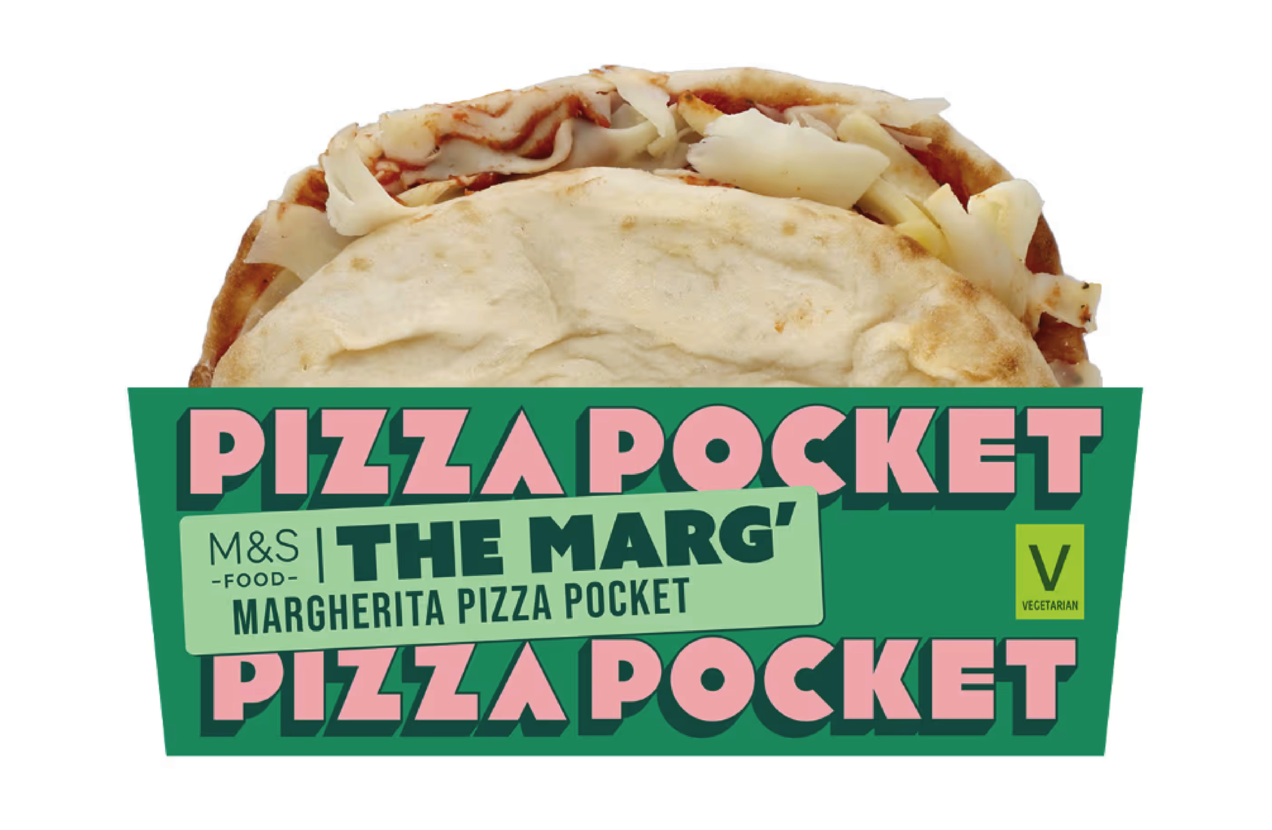
Vibrant coloured packaging on pizza pocket
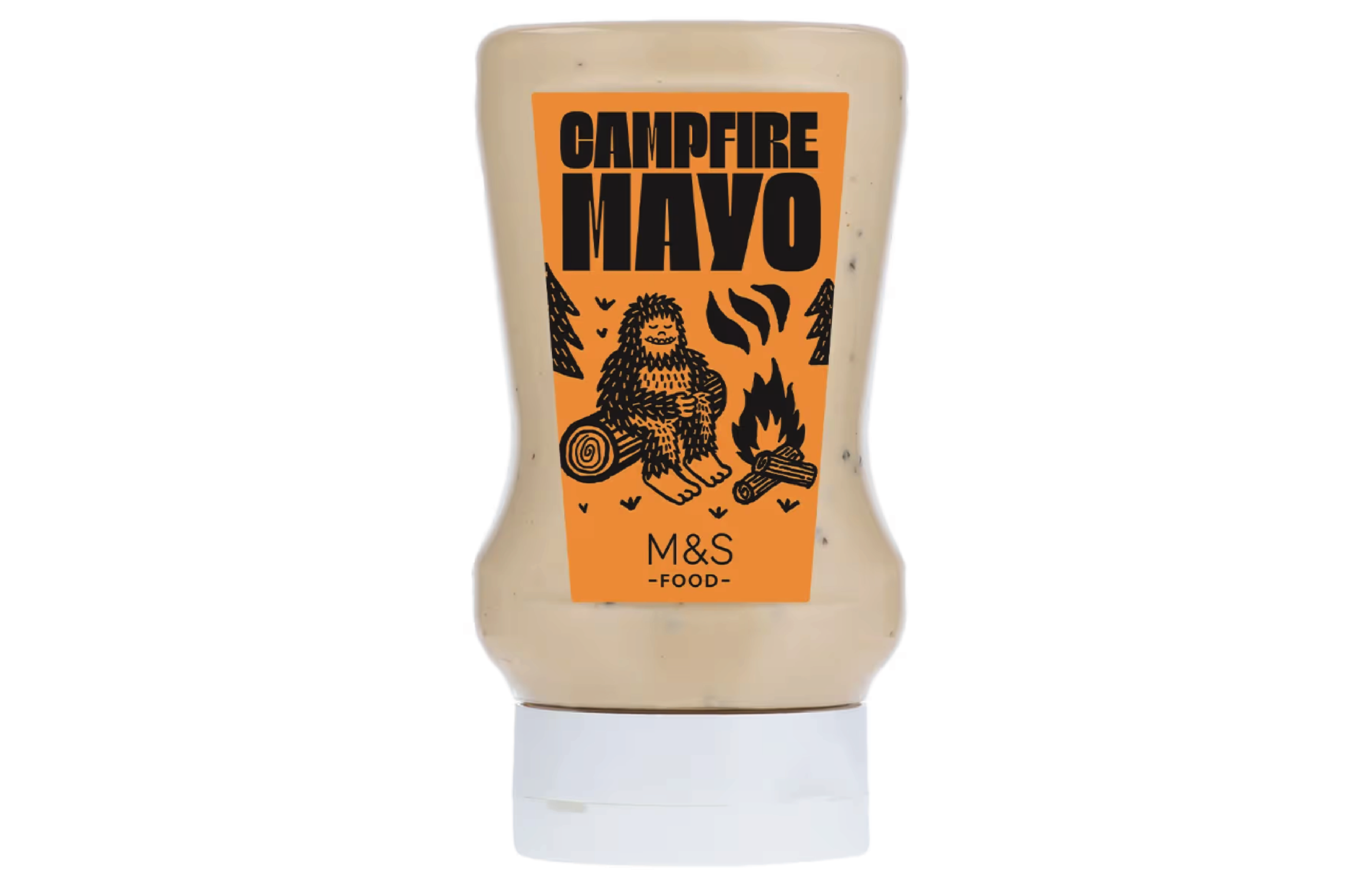
Illustrated mascot on “Campfire Mayo”
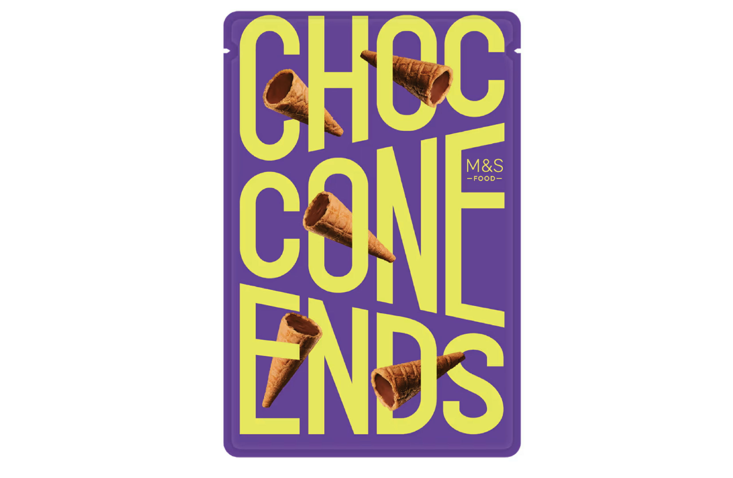
Expressive typography on chocolate cone snack